
And the Winner Is…(The (Miss) Universe of Bad Design)
If you’ve been anywhere near a media source in the last few days, you’ve probably heard about the epic gaff (http://money.cnn.com/2015/12/21/media/miss-universe-2015-donald-trump/ ) made by poor Steve Harvey at the 2015 Miss Universe pageant. It's hard to imagine a worse mistake at a beauty pageant than to announce the wrong winner! However, in the world of User Experience (UX) design, we never blame the user for mistakes; rather, we look to see how changes in design would have prevented the error from happening in the first place. Preventing errors is on the Ben Shneiderman’s Eight Golden Rules of Interface Design, which we’ll explore in detail next year. For now, let’s see how some design changes might have saved Mr. Harvey from that mistake.
Let’s take a look at the card itself:
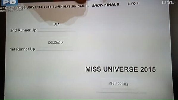
Copyright 2015, The Miss Universe Organization
Our first impression here is that this card is not well designed at all. Considering this card has to be read in front of both a live audience and during a live broadcast, it needs to be extremely clear what the relevant information is. A host can’t be doing a lot of extra thinking during this kind of event, so the tools (in this case, the card) need to effectively do that thinking for the host.
Donald Norman, the frequently quoted UX expert and principal at the Nielsen Norman Group, spoke to us years ago about the ways that people make mistakes when performing complex tasks. One can misunderstand information, so when they take action they don’t get the results they want. Or, one can understand a situation but take the wrong action, such as clicking the wrong button. These are referred to as the Gulf of Evaluation and the Gulf of Execution, respectively. In Mr. Harvey’s case, he was tripped up by the former. As UX designers, one of our jobs is to get our users safely across these gulfs.
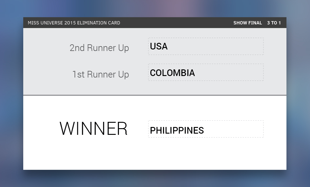
Application of solid design principles would have prevented this problem. A cleaner layout, better font selection, and changes to the wording would produce a results card that would have been much harder to misread. Our team tackled this, and here is our updated design.
I’ve mentioned here on several occasions how good design can save time, money, and even lives in critical cases. This case is sure to be looked at for years to come as an example of the pitfalls of bad design. Hopefully the organizers of next year’s events will consult some designers and remedy the problem before showtime!
Reference
Miss Universe Pageant, Money Magazine Article, last accessed website December 22, 2015, (http://money.cnn.com/2015/12/21/media/miss-universe-2015-donald-trump/