
Creating QML Controls From Scratch
QML provides a very powerful and flexible framework for developing user interfaces. The basic elements that are provided are low level, so you typically need to build up the components of your user interface into widget-like controls. Developing a set of common QML controls can greatly reduce the overall development effort of your project.
In this series (which assumes you're familiar with basic QML), we will create a set of minimalistic QML controls from scratch (i.e. from QML primitives Item, Rectangle, Text, etc.) that can be used as a starting point for the controls in your mobile or embedded project, and then modified to suit your project's needs (i.e. so you aren't starting from scratch).
Reusable Controls
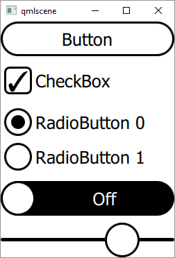
User interfaces are almost always composed of a set of reusable "controls" such as Button, CheckBox, RadioButton, Switch, Slider, etc. The controls might be designed to be reused only within the same project (e.g. two buttons on a screen), or they can be more general purpose (customizable) controls that can be reused across multiple projects (e.g. Qt Quick Controls).
Qt Quick Controls source code isn't intended to be modified. Rather, the developer writes separate "styling code" to customize. In this series, we will take an alternate "by example" approach where you as the developer have 100% control over the source code, appearance, and behavior of each control.
Rather than writing separate styling code (and learning styling APIs), you can simply modify the source code for our controls directly. Please watch my 10 minute lightning talk from Qt World Summit 2016 for further explanation on the rationale behind this "from scratch" approach.
To reduce them to their essence and keep them clear, simple, and reusable, the controls we create will adhere to the following properties:
- No animations: other than the default scrolling animations provided by Flickable (e.g. ListView and GridView) and unless necessary (e.g. Spinner); however, you can add your own animations.
- No states and transitions: states and transitions may be added and are useful to implement animations.
- QML only (no C++): the focus here is the QML front end; however, a C++ back end can be added.
- No image assets (.png, .jpg): to ensure the controls look good at any size and to avoid any copyright issues; however, you may add icons with the QML Image element. Watch my lightning talk for more information.
- Black and white: to make the controls "style-less" and make it easy for you to add your color scheme (see Styling below) and/or Image .png assets.
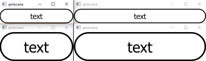
- Resizable: each control scales with either the height or width of the root Item so that it looks good at any size (and thus on any screen size and resolution).
Controls
The list of controls we will create is below. We'll start with a simple Button and work up in complexity:
- Button
- CheckBox and RadioButton
- Switch
- Slider
- ScrollBar
- ProgressBar
- Spinner
- Dialog
- PageDots
- Tabs
- Table
- TimePicker
- DatePicker
- BarChart
- LineChart
- PieChart
- Keyboard
Primitives
We will build all controls using only the QML primitives listed below:
With the exception of Canvas, all of the above primitives were available in Qt Quick 1.0. So as an added bonus, by replacing "import QtQuick 2.0" with "import QtQuick 1.0", we also can use our controls in old code using Qt 4 or qmlviewer.
Styling
The only primitive items above that actually render pixels on the screen are Rectangle, Text, and Canvas (the rest are for layout or user interaction). Canvas is only used in a couple of cases (PieChart and LineChart) that Rectangle can't handle, so to "style" (i.e. change colors, fonts, etc.), Rectangle and Text are the only items you need to modify and/or possibly replace with Image .png assets.
Change color by changing Rectangle.color (default 'white'), Rectangle.border.color (default 'black'), and Text.color (default 'black') where appropriate. If you prefer to change your application's font in one place instead of setting font.family in every Text element, you can create FontText.qml (below) and use FontText instead of Text in all .qml files:
FontText.qml
import QtQuick 2.0

Text {
    font.family: 'Arial'
}
Below is our first control: the simple and ubiquitous Button, which will give us a feel for how the remaining controls will be developed. Each example will be comprised of:
- An animated screen capture of the control.
- A written description of how the control is implemented.
- Source code (less than 100 lines) for the control (a .qml file that can be loaded in qmlscene), with public and private sections clearly delimited by comments (since QML doesn't have public nor private keywords). Note also that the control inherits all public properties, methods, and signals of the root Item, which will at least include those of Item e.g. x, y, width, height, anchors, and enabled.
- Example usage in the file Test.qml (i.e. how to create an instance of the control).
Button
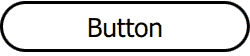
Button has a public text property and clicked() signal. It is composed of only a Rectangle, Text, and a MouseArea. The Rectangle's border draws the Button's outline and MouseArea manages the Button's appearance when pressed ("down state") and clicked() signal.
The easiest way to create a down state is to set the root Item's opacity. Other methods include setting Rectangle.color or providing a .png via Image (not recommended for resizing). To allow resizing, the Rectangle's border and font.pixelSize scale with the root Item's height, as seen below.
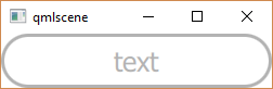
All QML Items have an enabled property and we exploit it to provide a "disabled state" by setting the root Item's opacity to 0.3 (30%) to create a "faded" look when enabled is set to false.
Button.qml
import QtQuick 2.0

Rectangle {
    id: root

// public
    property string text: 'text'

    signal clicked(); // onClicked: print('onClicked')

// private
    width: 500;  height: 100 // default size
    border.color: text? 'black': 'transparent' // Keyboard
    border.width: 0.05 * root.height
    radius:       0.5  * root.height
    opacity:      enabled  &&  !mouseArea.pressed? 1: 0.3 // disabled/pressed state

    Text {
        text: root.text
        font.pixelSize: 0.5 * root.height
        anchors.centerIn: parent
    }

    MouseArea {
        id: mouseArea

        anchors.fill: parent

        onClicked:  root.clicked() // emit
    }
}
Test.qml
import QtQuick 2.0

Button {
    text: 'Button'

    onClicked: print('Button onClicked')
}
Summary
In this first installment of the QML Controls From Scratch series we created our first control: Button. Next time we'll create CheckBox and RadioButton. The source code can be downloaded from here. Be sure to check out my webinar on-demand. I walk you through all 17 QML controls with code examples.