
Creating QML Controls From Scratch: BarChart
Continuing our QML Controls from Scratch series, this time we will implement a BarChart. Many people who need charts in their application wonder if they need a charting library, but it turns out to be not that difficult to write a custom autoscaled chart.
The public interface consists of a title, yLabel, xLabel, and a list of points, which contains a string for x, a number for y, and a color. Since Rectangle can be used to draw a line, all the pixels are rendered with just Rectangle and Text (as are all the controls so far in this series). The only tricky part is the math necessary to compute the y axis tick lines, which is accomplished via a logarithm.
BarChart.qml
import QtQuick 2.0

Item {
    id: root

 // public
    property string title:  'title'
    property string yLabel: 'yLabel'
    property string xLabel: 'xLabel'

    property variant points: []//{x: 'Zero', y: 60, color: 'red'}, {x: 'One', y: 40, color: 'blue' }]

 // private
    property double factor: Math.min(width, height)

    property double yInterval:  1
    property double yMaximum:  10 // set by onPointsChanged
    property double yMinimum:   0
    function toYPixels(y){return plot.height / (yMaximum - yMinimum) * (y - yMinimum)}

    property int    xMaximum:   0 // string length

    onPointsChanged: { // auto scale vertically
        if(!points)  return
        var xMaximum = 0, yMinimum = 0, yMaximum = 0
        for(var i = 0; i < points.length; i++) {
            if(points[i].y > yMaximum)          yMaximum = points[i].y
            if(points[i].y < yMinimum)          yMinimum = points[i].y
            if(points[i].x.length > xMaximum)   xMaximum = points[i].x.length
        }

        var yLog10     = Math.log(yMaximum - yMinimum) / Math.LN10 // take log, convert to integer, and then raise 10 to this power
        root.yInterval = Math.pow(10, Math.floor(yLog10)) / (yLog10 % 1 < 0.7? 4: 2) // distance between ticks
        root.yMaximum  = Math.ceil( yMaximum / yInterval) * yInterval
        root.yMinimum  = Math.floor(yMinimum / yInterval) * yInterval

        root.xMaximum  = xMaximum
    }

    width: 500;  height: 500 // default size

    Text { // title
        text: title
        anchors.horizontalCenter: parent.horizontalCenter
        font.pixelSize: 0.03 * factor
    }

    Text { // y label
        text: yLabel
        font.pixelSize: 0.03 * factor
        y: 0.5 * (2 * plot.y + plot.height + width)
        rotation: -90
        transformOrigin: Item.TopLeft
    }

    Text { // x label
        text: xLabel
        font.pixelSize: 0.03 * factor
        anchors{bottom: parent.bottom;  horizontalCenter: plot.horizontalCenter}
    }

    Item { // plot
        id: plot

        anchors{fill: parent;  topMargin: 0.05 * factor;  bottomMargin: (0.015 * xMaximum + 0.05) * factor;
                              leftMargin: 0.15 * factor;  rightMargin: 0.05 * factor}

        Repeater { // y axis tick marks and labels
            model: Math.floor((yMaximum - yMinimum) / yInterval) + 1 // number of tick marks

            delegate: Rectangle {
                property double value: index * yInterval + yMinimum
                y: -toYPixels(value) + plot.height
                width: plot.width;  height: 1
                color: 'black'

                Text {
                    text: parent.value
                    anchors{right: parent.left;  verticalCenter: parent.verticalCenter;  margins: 0.01 * factor}
                    font.pixelSize: 0.03 * factor
                }
            }
        }

        Repeater { // data
            model: points

            delegate: Item { // column
                width: plot.width / points.length;  height: plot.height
                x: width * index

                Rectangle { // bar
                    anchors{horizontalCenter: parent.horizontalCenter
                        bottom: modelData.y > 0? parent.bottom: undefined;  bottomMargin: toYPixels(0)
                        top:    modelData.y < 0? parent.top:    undefined;     topMargin: plot.height - toYPixels(0)}
                    width:  0.7 * parent.width;  height: toYPixels(Math.abs(modelData.y) + yMinimum)
                    color: modelData.color
                }

                Text { // x values (rotated -90 degrees)
                    text: modelData.x
                    x:   (parent.width - height) / 2
                    y:    parent.height + width + 0.5 * height
                    rotation: -90
                    transformOrigin: Item.TopLeft
                    font.pixelSize: 0.03 * factor
                }
            }
        }
    }

   // focus: true
   // Keys.onPressed: { // increase values with 0-9 and decrease with Alt+0-9
       // if(!isNaN(parseInt(event.text))  &&  parseInt(event.text) < root.points.length) { // 0-9 keys
           // var points = root.points
           // points[event.text].y = points[event.text].y + (event.modifiers? -0.1: 0.1) * (yMaximum - yMinimum)
           // root.points = points
       // }
   // }
}
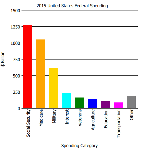
Test.qml
import QtQuick 2.0

BarChart {
    title:  '2015 United States Federal Spending'
    yLabel: '$ Billion'
    xLabel: 'Spending Category'
    points: [
        {x: 'Social Security',  y: 1275.7, color: 'red'    },
        {x: 'Medicare',         y: 1051.8, color: 'orange' },
        {x: 'Military',         y:  609.3, color: 'gold'   },
        {x: 'Interest',         y:  229.2, color: 'cyan'   },
        {x: 'Veterans',         y:  160.6, color: 'green'  },
        {x: 'Agriculture',      y:  135.7, color: 'blue'   },
        {x: 'Education',        y:  102.3, color: 'purple' },
        {x: 'Transportation',   y:   85.0, color: 'magenta'},
        {x: 'Other',            y:  186.3, color: 'gray'   },
    ]
}
Summary
In this post, we created a BarChart. Next time we'll create a LineChart. The source code can be downloaded here.