
Creating QML Controls From Scratch: PieChart
Continuing our QML Controls from Scratch series, this time we will implement a PieChart. PieChart's public API consists of just a title and a list of points (whose x, y, and color members are identical to that of BarChart). Since PieChart is a Canvas, it makes heavy use of the Context2D API to draw its pie slices, callout lines, and text. We use a modified cosine to make the callout lines longer on the top/bottom and shorter on the sides so the text doesn't overlap when the pie slices are small and close together.
Note: If using Qt 4 and/or QtQuick 1, replace Canvas either by a custom QDeclarativeItem or an Image fed by a QDeclarativeImageProvider.
PieChart.qml
import QtQuick 2.0

Canvas {
    id: root

 // public
    property string title: 'title'

    property variant points: []//{x: 'Zero', y: 60, color: 'red'}, {x: 'One', y: 40, color: 'blue' }] // y values don't need to add to 100

 // private
    onPointsChanged: requestPaint()

    width: 500;  height: 500 // default size
    property double factor: Math.min(width, height)

    Text { // title
        text: title
        anchors.horizontalCenter: parent.horizontalCenter
        font.pixelSize: 0.03 * factor
    }

    onPaint: {
        var context    = getContext("2d")
        var total      = 0 // automatically calculated from points.y
        var start      = -Math.PI / 2 // Start from vertical. 0 is 3 o'clock and positive is clockwise
        var radius     = 0.2  * factor
        var pixelSize  = 0.03 * factor // text
        context.font   = pixelSize + 'px arial'

        for(var i = 0; i < points.length; i++)  total += points[i].y // total

        context.clearRect(0, 0, width, height) // new points data (animation)

        for(var i = 0; i < points.length; i++) {
            var end    = start + 2 * Math.PI * points[i].y / total // radians
            var center = Qt.vector2d(width / 2, height / 2) // center

            // pie
            context.fillStyle = points[i].color
            context.beginPath()
            var midSlice = Qt.vector2d(Math.cos((end + start) / 2), Math.sin((end + start) / 2)).times(radius) // point on edge/middle of slice
            context.arc(center.x, center.y, radius, start, end) // x, y, radius, startingAngle (radians), endingAngle (radians)
            context.lineTo(center.x, center.y) // center
            context.fill()

            // line
            context.lineWidth   = 0.005 * factor
            context.strokeStyle = points[i].color
            context.beginPath()
            context.moveTo(center.x + midSlice.x, center.y + midSlice.y) // center

            var angle = (start + end) / 2 // of line
            var point = midSlice.times(1 + 1.4 * (1 - Math.abs(Math.cos(angle)))).plus(center) // elbow of line
            context.lineTo(point.x, point.y)
            context.lineTo(point.x + (point.x < center.x? -1: 1) * 0.5 * pixelSize, point.y) // horizontal
            context.stroke()

            // text
            context.fillStyle = 'black'
            var percent   = points[i].y / total * 100
            var text      = points[i].x + ' ' + (percent < 1? '< 1': Math.round(percent)) + '%' // display '< 1%' if < 1
            var textWidth = context.measureText(text).width
            context.fillText(text, (point.x < center.x? -textWidth - 0.5 * pixelSize: 0.5 * pixelSize) + point.x, point.y + 0.4 * pixelSize)

            start = end // radians
        }
    }

   // focus: true
   // Keys.onPressed: { // increase values with 0-9 and decrease with Alt+0-9
       // if(!isNaN(parseInt(event.text))  &&  parseInt(event.text) < root.points.length) { // 0-9 keys
           // var points = root.points
           // points[event.text].y = points[event.text].y + (event.modifiers? -0.1: 0.1) * points[event.text].y
           // root.points = points
       // }
   // }
}
Test.qml
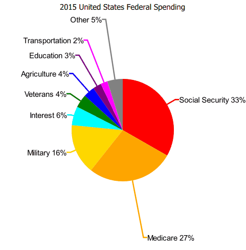
import QtQuick 2.0

PieChart {
    title:  '2015 United States Federal Spending'
    points: [
        {x: 'Social Security',  y: 1275.7, color: 'red'    },
        {x: 'Medicare',         y: 1051.8, color: 'orange' },
        {x: 'Military',         y:  609.3, color: 'gold'   },
        {x: 'Interest',         y:  229.2, color: 'cyan'   },
        {x: 'Veterans',         y:  160.6, color: 'green'  },
        {x: 'Agriculture',      y:  135.7, color: 'blue'   },
        {x: 'Education',        y:  102.3, color: 'purple' },
        {x: 'Transportation',   y:   85.0, color: 'magenta'},
        {x: 'Other',            y:  186.3, color: 'gray'   },
    ]
}
Summary
In this post, we created a PieChart. Next time we'll create a Keyboard. The source code can be downloaded here.