Design Cues for Navigating Large-Format Touchscreens
People are impatient and distracted. You’re probably scrolling through your Instagram while reading this blog. Or replying to your boss’ email. Or ordering sushi. Point is, you’re busy and don’t have time to waste navigating hard-to-use sites, apps or touchscreens.
Neither do the users you design for.
That’s why when designing presentations for large-format touchscreens, your goal should be to make the user understand immediately how to navigate. If the interface requires instructions, it is too complicated. Cleverly conveying interactivity is key.
The Role of Design Affordance
Donald Norman in his 1988 book The Psychology of Everyday Things first applied the term affordance to design in regards to the interaction of a physical object. According to Norman, affordance refers to both actual and perceived properties. He offers a rubber ball as an example. The ball’s affordance includes its round shape, physical material and "bounceability" (its actual properties), as well as the perceived suggestion as to how to use the ball (its perceived properties). Here’s another example. The handle on your morning coffee communicates to you how to hold the mug.
The interaction design community is focused on perceived affordance, in which the user evaluates the objects in a user interface (UI) and perceives how to use them. It is up to designers to make it easy for users to understand how to use objects.
Touchscreen-based interface designers have disadvantages in this area because their users can’t hover over buttons to see a state change, or see a helpful tooltip of what that action may perform. Touchscreens that take advantage of multi-touch gestures, which likely require additional education for the user, present even greater design affordance challenges. That's because the interactivity of the touchscreen interface must quickly and clearly convey itself to the user.
Go Ahead, Touch the Screen
How can you create a touchscreen that is easy to understand and use? One of the first requirements is to communicate that the screen is in fact touchable.
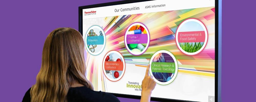
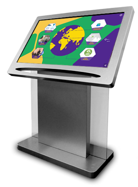
The rise of digital signage has exploded in recent years and screens are appearing everywhere in retail, trade show and corporate environments. One way to differentiate an interactive presentation from digital signage is by using an angled configuration. While digital signage is mounted on the wall, an angled installation clearly conveys a touchscreen.
At ICS' ViewPoint, we design touchscreen kiosks so that in idle states, our kiosks often include graphical messaging to compel people to come touch the screen. And we design the UI to quickly inform its function as an interface and not static signage.
Communicating Interactive Elements
We take great care to create beautiful and intuitive UI. Elements that are interactive are designed to be easily readable. Animation can be added to interactive objects to enhance the perceived affordance.
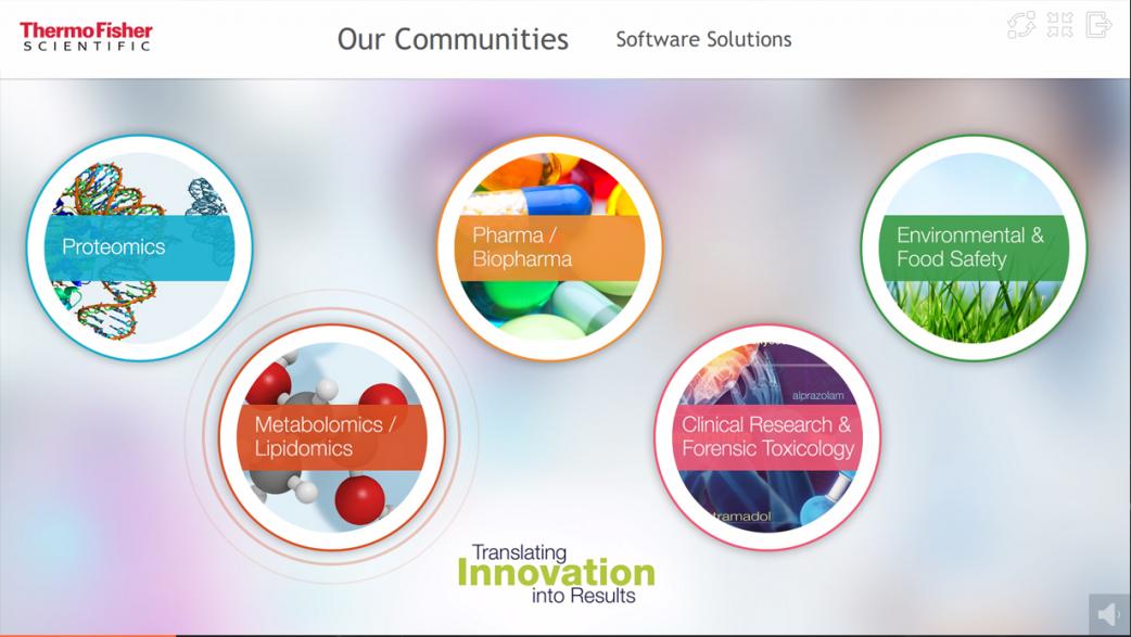
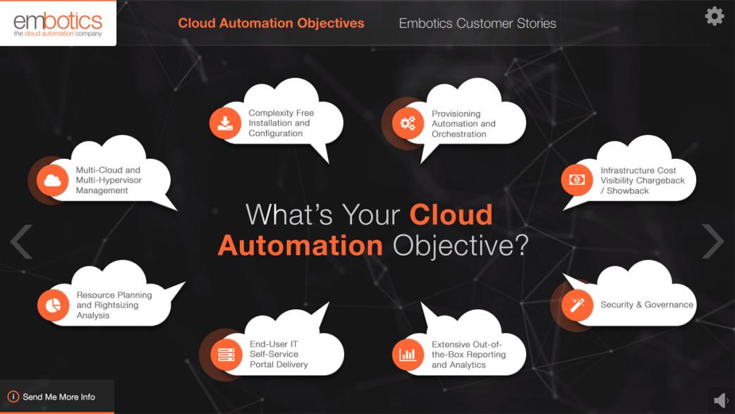
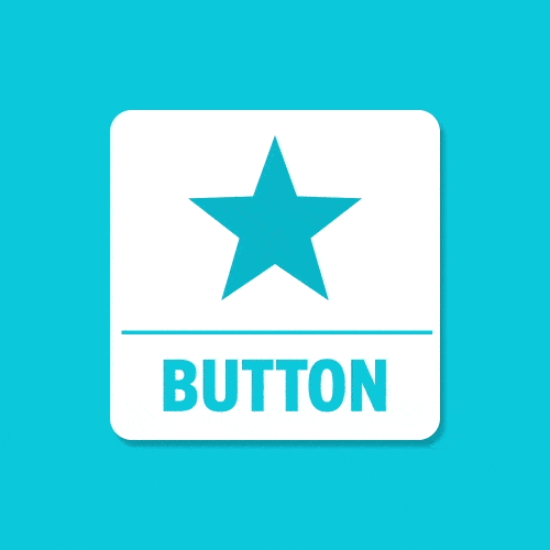
Viewpoint’s touchscreen experiences also contain several subtle built-in animations that can be easily added to buttons, including bounces and rotations. Advanced button animations, from pulses to glows — even video content — can also be effective.
For instance, you can see how the Thermo Fisher example below indicates pulse, while the Embotics example showcases glow. I've also included an animated button as an example.
Creating Intuitive Gestural Interfaces
One of the building blocks of Viewpoint is the use of the Coverflow interface, where users can swipe horizontally to navigate a menu. We often have content on adjacent sections peek out of the sides of the screen as a visual aid that communicates there is more content on either side of the current section. Users can swipe horizontally, tap the menu labels, or tap on the edges of the screen to navigate to the adjacent sections.
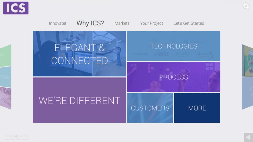
The combination of these techniques provide a system for immediate understanding. So, when someone walks up to one of our kiosks they instantly understand how to navigate even if they’ve never used a touchscreen kiosk before.
Providing an intuitive user interface should be your priority. My colleagues and I take great care to provide the best possible experience for our users. That’s one reason people love ViewPoint's touchscreen experiences. Understanding perceived affordance will help your clients love your designs, too!
For more of ICS’ UX-themed content, click here. To learn more about ViewPoint's interactive touchscreen experiences, check out our blog or visit www.viewpointtouch.com.