Beautiful But Dangerous: Cinematic Interfaces in the Real World
When I was an engineering student at WPI, one of the non-technical classes I took required us to read Mary Shelley’s classic book Frankenstein. As a young geek, I had already read it, but not with the intent of analyzing the very important theme running through it that all technologists should consider: just because you can do something doesn’t mean you should do something.
Victor Frankenstein was so obsessed with conquering death that he didn’t stop to think through the repercussions, and the results…. Well, if you don’t know, read the book.
There are many stories that follow a similar theme. In 1990, Michael Crichton wrote Jurassic Park, which in my opinion was pretty much the same story as Frankenstein. The major difference is that the dinosaurs were created for profit, but the end results were as catastrophic as Victor’s experiment. An excellent line from Justin Cronin’s book The Twelve (2012) nicely sums up how a lot of technology-centric folks think: “Sorry, we made vampires; it seemed like a good idea at the time.”
Now, let’s extrapolate this concept to User Experience (UX) Design and Visual Design. As a UX person, when a new movie comes out I often find myself analyzing the user interfaces in the film, both for aesthetics and for usability. This is something Chris Noessel does every month on his excellent Sci-Fi Interfaces website (http://www.scifiinterfaces.com). He discusses a vast number of interfaces, ranging from recent ones all the way back to the ones in Metropolis, which came out in 1927. There are many wonderful-looking interfaces listed on Noessel’s site, created by very talented visual designers and artists with the goal of looking amazing on the big screen. The question is then, how usable are they?
For example, in 2008’s Iron Man, when Tony Stark takes his first test flight around the Santa Monica Ferris Wheel, the audience is treated to a view of the HUD (Head-Up Display) that Tony uses to navigate as he flies around. The graphics look incredible on the big screen, and are in fact based in part on controls used in actual fighter jets. However, as we start to analyze the scene further, we start to realize that putting that kind of display in a flying, weaponized exoskeleton would be a very bad idea. Further analysis can be found at (1).
In the 30 seconds of film that Tony is flying around, we see approximately 30 different visual elements on the screen, many of which persist for less that two seconds, and most also overlap some other visual element. The notion of having informational graphics pop up, and then having only two seconds to extract any useful information from them - all while trying to not make a big crater on the Santa Monica Pier - seems a bit daunting to me. But then, I’m not Tony Stark.
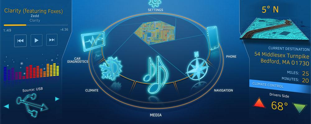
We can extend this idea into the automotive world. ICS has worked in the field of In-Vehicle Infotainment (IVI) systems for several years. One of our first projects was a venture with Intel, which called on us to design and implement an example IVI system to demonstrate the core features and impressive graphics capabilities of the Intel hardware (2). What made the project interesting for us as designers was that we specifically set out to create something that looked amazing, but that wouldn’t necessarily ever be useable in a moving vehicle. In effect, we were intentionally sacrificing usability for the sake of visual coolness. I believe we succeeded and ended up with a great-looking system, but not one that should ever actually be used in a moving vehicle.
Every client wants a compelling user interface, and as designers we do our best to satisfy that requirement. However, we also have to look at the bigger picture and consider where and how this interface will be used. UX Design is sometimes considered less glamorous than Visual Design, but if real people are using your system in potentially life-threatening situations, then it’s critical.
As designers, we must weigh how eye-catching we make the visuals in a system and balance against the required usability. The best interfaces are the ones that provide both aspects. While I love watching the flight scene from Iron Man and geeking out at the graphics, I don’t want a version of it in my Jeep.
https://scifiinterfaces.wordpress.com/category/marvel-cinematic-univers…
https://www.ics.com/services/ivi/future