
Creating QML Controls From Scratch: CheckBox and RadioButton

Continuing our QML Controls from Scratch series, this time we'll implement a CheckBox. We'll also get RadioButton almost for free. CheckBox is similar to Button with the exception that it holds checked/unchecked state in the checked property. All QML properties have an associated *Changed signal, so the checkedChanged() signal causes onCheckedChanged to run when the property checked changes.
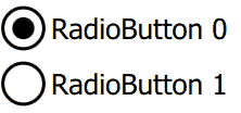
CheckBox also serves as a radio button if a client sets radio: true, which is all RadioButton.qml does. To get multiple radio buttons to act together in a group, put a RadioButton in a ListView delegate with currentIndex indicating the currently selected radio button (see test.qml below).
Since we're not using Image, we used a check ✓ (hexadecimal 2713) unicode glyph to render the check mark as Text, but you might want to replace with an Image .png asset from your designer. The RadioButton dot is implemented with a Rectangle.
Take a look:
CheckBox.qml
import QtQuick 2.0

Item {
    id: root

// public
    property string text:    'text'
    property bool   checked: false

    signal clicked(bool checked);   //onClicked:{root.checked = checked;  print('onClicked', checked)}

// private
    property real padding: 0.1    // around rectangle: percent of root.height
    property bool radio:   false  // false: check box, true: radio button

    width: 500;  height: 100                         // default size
    opacity: enabled  &&  !mouseArea.pressed? 1: 0.3 // disabled/pressed state

    Rectangle { // check box (or circle for radio button)
        id: rectangle

        height: root.height * (1 - 2 * padding);  width: height // square
        x: padding * root.height
        anchors.verticalCenter: parent.verticalCenter
        border.width: 0.05 * root.height
        radius: (radio? 0.5: 0.2) * height

        Text { // check
            visible: checked  &&  !radio
            anchors.centerIn: parent
            text: '\u2713' // CHECK MARK
            font.pixelSize: parent.height
        }

        Rectangle { // radio dot
            visible: checked  &&  radio
            color: 'black'
            width: 0.5 * parent.width;  height: width // square
            anchors.centerIn: parent
            radius: 0.5 * width // circle
        }
    }

    Text {
        id: text

        text: root.text
        anchors {left: rectangle.right;  verticalCenter: rectangle.verticalCenter;  margins: padding * root.height}
        font.pixelSize: 0.5 * root.height
    }

    MouseArea {
        id: mouseArea

        enabled: !(radio  &&  checked) // selected RadioButton isn't selectable
        anchors.fill: parent

        onClicked: root.clicked(!checked) // emit
    }
}
RadioButton.qml
import QtQuick 2.0

CheckBox {
    radio: true
}
Test.qml
CheckBox {
    property bool backend: false

    text: 'CheckBox'
    checked:   backend

    onClicked: backend = checked
}

ListView { // RadioButton
    id: radioButtons

    interactive: false

    model: [{text: 'RadioButton 0'}, {text: 'RadioButton 1'}]

    delegate: RadioButton {
        text:      modelData.text
        checked:   radioButtons.currentIndex == index // equality

        onClicked: radioButtons.currentIndex  = index // assignment
    }
}
Summary
In this post, we created CheckBox and RadioButton. Next time we'll create Switch. The source code can be downloaded here. Be sure to check out my webinar on-demand. I walk you through all 17 QML controls with code examples.