
Creating QML Controls From Scratch: Table
Continuing our QML Controls from Scratch series, this time we will implement a Table (i.e. a two-dimensional matrix of strings supporting an arbitrary number of rows and columns). The Table consists of two main parts: header and data. Consequently, it has two public properties (headerModel and dataModel) and one public clicked() signal, which is emitted when the user taps on a row of data. Both header and data are implemented with ListViews.
The header background implements a half-rounded Rectangle by composing two Rectangles: one for the top two rounded corners, and another un-rounded Rectangle of half height to cover the bottom two round corners. The data ListView has a nested delegate (the second from a Row Repeater) so we must take care to store the index and modelData of the outer delegate. The column widths can be adjusted by setting the width property in headerModel (the sum of which must add to one). We reuse our ScrollBar control to indicate how far the data has been scrolled.
Table.qml
import QtQuick 2.0

Item { // size controlled by width
    id: root

// public
    property variant headerModel: [ // widths must add to 1
        // {text: 'Color',         width: 0.5},
        // {text: 'Hexadecimal',   width: 0.5},
    ]

    property variant dataModel: [
        // ['red',   '#ff0000'],
        // ['green', '#00ff00'],
        // ['blue',  '#0000ff'],
    ]

    signal clicked(int row, variant rowData);  //onClicked: print('onClicked', row, JSON.stringify(rowData))

// private
    width: 500;  height: 200

    Rectangle {
        id: header

        width: parent.width;  height: 0.14 * root.width
        color: 'black'
        radius: 0.03 * root.width

        Rectangle { // half height to cover bottom rounded corners
            width: parent.width;  height: 0.5 * parent.height
            color: parent.color
            anchors.bottom: parent.bottom
        }

        ListView { // header
            anchors.fill: parent
            orientation: ListView.Horizontal
            interactive: false

            model: headerModel

            delegate: Item { // cell
                width: modelData.width * root.width;  height: header.height

                Text {
                    x: 0.03 * root.width
                    text: modelData.text
                    anchors.verticalCenter: parent.verticalCenter
                    font.pixelSize: 0.06 * root.width
                    color: 'white'
                }
            }
        }
    }

    ListView { // data
        anchors{fill: parent;  topMargin: header.height}
        interactive: contentHeight > height
        clip: true

        model: dataModel

        delegate: Item { // row
            width: root.width;  height: header.height
            opacity: !mouseArea.pressed? 1: 0.3 // pressed state

            property int     row:     index     // outer index
            property variant rowData: modelData // much faster than listView.model[row]

            Row {
                anchors.fill: parent

                Repeater { // index is column
                    model: rowData // headerModel.length

                    delegate: Item { // cell
                        width: headerModel[index].width * root.width;  height: header.height

                        Text {
                            x: 0.03 * root.width
                            text: modelData
                            anchors.verticalCenter: parent.verticalCenter
                            font.pixelSize: 0.06 * root.width
                        }
                    }
                }
            }

            MouseArea {
                id: mouseArea

                anchors.fill: parent

                onClicked:  root.clicked(row, rowData)
            }
        }

        ScrollBar{}
    }
}
Test.qml
import QtQuick 2.0
Table {
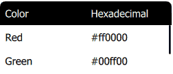
headerModel: [ // widths must add to 1
{text: 'Color', width: 0.5},
{text: 'Hexadecimal', width: 0.5},
]
dataModel: [
['Red', '#ff0000'],
['Green', '#00ff00'],
['Blue', '#0000ff'],
]
onClicked: print('onClicked', row, JSON.stringify(rowData))
}Summary
In this post, we created a Table control. Next time we'll create a TimePicker. The source code can be downloaded here. If you missed any of the previous installments, here's a list of the other controls created in this series.