
Creating QML Controls From Scratch: Tabs
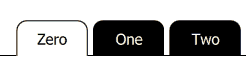
Continuing our QML Controls from Scratch series, this time we will implement Tabs. They are used to expand limited screen real estate by providing two or more "tabs" that divide the user interface into screens (content), only one of which is shown at a time. The Tabs control only renders the tabs themselves. A screen (content) for each tab must be implemented separately.
Tabs has two public properties of interest: model (an array of strings) and currentIndex (indicating the currently selected tab), both of which are from ListView. To implement the content for each tab, simply provide an Item for each tab, and connect each Item's visible property to currentIndex in a binding. For instance:
Item {
    visible: tabs.currentIndex == 0
    ...
Here are a couple of our tricks for implementing Tabs:
1. To render a half-rounded Rectangle for each tab, we wrap a rounded Rectangle (twice the tab height) in an Item whose clip property is set true to hide the lower half the the Rectangle (and its two unwanted bottom rounded corners).
2. To render the horizontal line at the bottom of Tabs (implemented with three Rectangles), we draw outside the bounding rectangle of the delegate. This technique is not usually needed nor recommended, but it does come in handy once in a while (as here). The horizontal line is broken into two lines: one left of the selected tab and one right of the selected tab.
Tabs.qml
import QtQuick 2.0

ListView {
    id: root

// public
    model:          []//'Zero', 'One', 'Two']
    currentIndex:   0

// private
    width: 500;  height: 100 // default size

    orientation: ListView.Horizontal
    interactive: false
    spacing: 0.1 * height
    clip: true // horizontal line

    header: Item{width: root.width - count * (2 * 0.7 * root.height + spacing)} // left

    delegate: Item { // tab
        width: 2 * height;  height: 0.7 * root.height
        y: root.height - height            // align bottom
        opacity: mouseArea.pressed? 0.3: 1 // pressed state

        Item { // don't clip horizontal line
            anchors.fill: parent
            clip: true

            Rectangle { // background
                width: parent.width;  height: 2 * parent.height
                border.width: 0.02 * root.height
                radius: 0.2 * root.height
                color: currentIndex == index? 'transparent': 'black'
            }
        }

        Text {
            text: modelData
            font.pixelSize: 0.3 * root.height
            anchors.centerIn: parent
            color: currentIndex == index? 'black': 'white'
        }

        Rectangle { // horizontal line at bottom left
            visible: currentIndex == index;
            anchors{bottom: parent.bottom;  right: parent.left}
            width: root.width;    height: 0.02 * root.height
            color: 'black'//green'
        }

        Rectangle { // horizontal line at bottom right
            visible: currentIndex == index;
            anchors{bottom: parent.bottom;  left:  parent.right}
            width: root.width;    height: 0.02 * root.height
            color: 'black'//blue'
        }

        MouseArea {
            id: mouseArea

            anchors.fill: parent
            enabled: currentIndex != index

            onClicked:  currentIndex = index
        }
    }
}
Test.qml
import QtQuick 2.0

Tabs {
    model:          ['Zero', 'One', 'Two']
    currentIndex:   0
}
Summary
In this post, we created a Tabs control, which is useful in situations when you have limited screen space. Next time we'll create a Table. The source code can be downloaded here.