ICS Works with Non-Profits to Develop Low-Cost Ventilators
This ongoing series provides a close-up look at our work helping two non-profit organizations, RespiraWorks and Project RED, create low-cost ventilators to fight COVID-19 in countries with developing economies. Progress reports will be posted regularly.
June 4, 2020
No one likes surprises on projects, and I have written many times about how to prepare for and budget for the unexpected. But those are negative surprises. Positive surprises, on the other hand, are welcome.
A few days ago, I got just such a surprise.
Thanks to all the blogging and the publicity we’ve received for the project with RespiraWorks to build a low-cost ventilator, another non-profit organization charting a slightly different but related path became aware of us. And they, a California-based non-profit encompassing volunteers from the U.S. and Canada called Project RED, were very interested in working with ICS on their project.
Project RED was founded in March by two veteran engineers with deep experience creating a commercial ventilator. Together, the founders have decades of product development experience for medical devices, aerospace equipment, consumer goods and scientific test equipment. On Project RED, their mission is to develop a low-cost, reliable, easy-to-manufacture emergency ventilator for use in worldwide crisis situations, like the pandemic we’re all struggling through.
Project RED asked us to create the UI for this new device, which they are aiming at hospitals in South America, Africa, India and other developing regions that can't afford existing commercial ventilators, which typically cost between $15,000 and $50,000.
Unlike the Respira project, for which we've helped create the prototype and will continue to assist with documentation, Project RED is not building an open source medical device. They do however plan to make the backend code available. And, the device’s user interface, the part of the project we’re working on, will be open source. The big advantage of open source projects is simply that: they’re open. The combination of more projects, more code and more learning leads to better products thanks to a robust open source community.
In the case of Project RED, the hardware is very similar to that used by Respira, and the HMI is nearly identical. So ICS’ job looks to be simple.
But not that simple.
There's always something, right? The first challenge out of the gate is that Project RED wants to modify the UX that we created for Respira so that settings are changed as a group rather than one at a time. Why? This makes it easier for the medical-professional user, as well as safer for a patient. In Project RED's view, if the user sets controls one at a time there’s potential for the user to change one setting in a series, get distracted and then fail to change the rest of the settings to a current configuration.
What makes this so interesting is that it's a UX issue that has life-and-death impact. Also, the fact that the updated UX/UI will be able to enforce settings made together or enable settings made apart regardless of how the backend accepts these updates. The business logic dictating how it works is enforced simply by adding an "OK" button in the right place.
Now it is up to ICS' UX design team to figure out the best way to achieve this modification. Once we have a design solution, we can generate new code and see how it actually works.
May 20, 2020
We just had the design review and hit our first major snag.
ICS has tools to convert UX to a working prototype so we like to spend time getting the UX just right, and then generate code and encourage users and stakeholders to try it. You can try it yourself! Here’s the link to the prototype.
The prototype is written in Qt/QML but it’s being compiled for and running with WebAssembly. While WebAssembly is slower than the native code and has serious memory restrictions, we find that getting the prototype into people's hands quickly is really important. By doing it this way, we don’t have to wait while we install the software or lose time while getting a prototype board.
So, in the design review several people made comments about the "mode" that defines the job the ventilator is performing. It is the button labeled AC/P in the screen below. When you click it, other options are presented. Several reviewers asked us to add an OK/Cancel button.
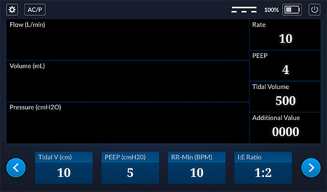
There also were several additional change requests. Some easy to address, some more difficult. None out of the ordinary. But none of those were the snag I mentioned. The snag was related to code review.
When we generated code from the Figma file it was 40K LOC. The RespiraWorks 62304 process requires a code review. For us, this isn’t a big problem because we’re used to reading machine-generated code. But not everyone is. I’ve worked on plenty of open source projects, and they only work if everyone works together. That means, we can’t just adhere to our process; we have to conform to RespiraWorks’ process. To that end, we developed a process of breaking the Figma into parts so the code drops would be small and manageable.
Here’s the snag: I hate working in multiple branches. I worry that the effort to break the UX up into parts so we can generate small code reviews, and the simultaneous effort to update the UX to incorporate changes may somehow step on one another. It hasn’t happened yet, but this is the type of thing to look out for.
It’s OK for a project to have many moving parts. Most do. The issue here is that the critical path is the code review. So we want that to start, but changes to the UX will inevitably result in changes to the code leading to more work.
Our job now is to figure it out and minimize the impact.
May 12, 2020
When we develop a device, we often create a simulator. The simulator is used to exercise the user interface (UI) so that each aspect can be used and tested. The simulator is first used for software development. In addition to confirming settings, it triggers options in the UI that can’t be seen without it.
In an FDA-regulated project, designing the UI and exercising it with simulators can be done before turning on Design Controls. This form of the UI is considered a prototype. It can be aligned with product requirements later in the project after formative studies have ironed out the kinks. The simulator helps create a 'live' experience that allows UI issues to be refined at a much higher level than might be possible with wireframes. This is a massive product design accelerator that reduces downstream changes when working with processes like IEC-62304 and ISO-13485.
In our ventilator project, the simulator can generate an alert, enabling the testing of the alert system. Eventually, the simulator will evolve and ultimately it is essential for formative studies and integration testing. In this way, we first conduct a simple unit test, then a more complex unit test, and then an overall system test.
While it may seem simplistic to show that a value set in the ventilator UI is indeed the same value in the simulator, this is an important step in confirming that this code was created correctly and has been verified. Using our GreenHouse process and tools means some of these steps can be automated, but verification and validation are always done manually.
Ventilator Simulator - UX design
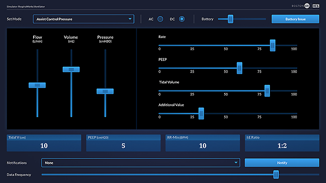
Notice that every input field in the ventilator is an output field in the simulator, and vice versa.
Ventilator Main Screen - UX design
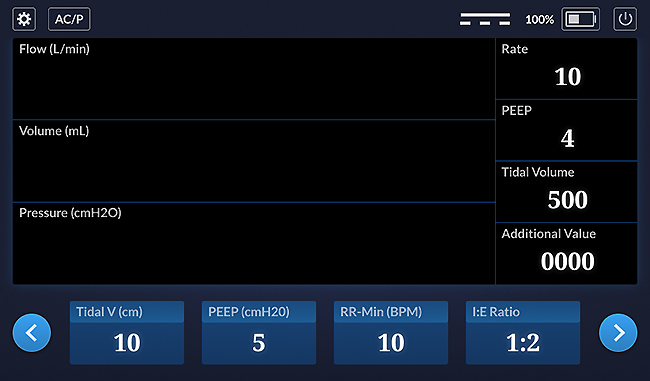
Notice that all of the icons now have ways of controlling their state and can be tested - that is, once the UX is turned into code.
May 8, 2020
We presented the UX to the Respira team. We ultimately combined the best design elements from the various concepts, as well as incorporated everyone’s feedback into the updated UX. We started to talk about exactly how the device works. By going over the UX in detail, we find that we can flush out many details early. I find this UX-first approach to be much better than pure agile because of the way it helps get us all on the same page, and it allows us to find problems early.
Now that the design is moving along, the project can accelerate. Here are the next steps:
- Get the visual portion of the HMI working
- Create a simulator that mimics the hardware and test the HMI
- Devise a plan for the waveform graphs
Our GreenHouse tools and processes will quickly generate a C++/Qt working prototype.
It looks like we’ll be building for Raspbian. It’s a solid choice. The code will be hosted on GitHUB. I don't yet know what build system or continuous integration we’re using, though. We had a conversation about open source licensing. I had assumed we were going to use a GPL and they had assumed a Berkley/Apache/MIT license, so we still have things to work out. I like the GPL because it helps the open source community grow. What starts open stays open.
Have an opinion on licensing? I’d love to hear from you. Please post your comments on social media. In the meanwhile, check out a few of the screens we’ve designed thus far:
Startup Screen
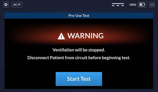
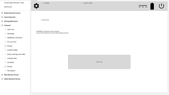
This is the startup screen, as well as the restart screen. The UI shows the "start test" button and message if it’s a restart. Otherwise, it goes straight to a diagnostic test and then opens the main window.
Main Screen
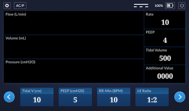
This is the main screen. The waveforms will be added later, once they’ve been designed.
Alert Screen
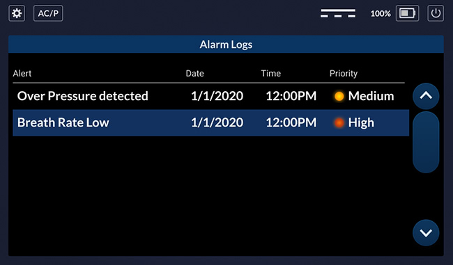
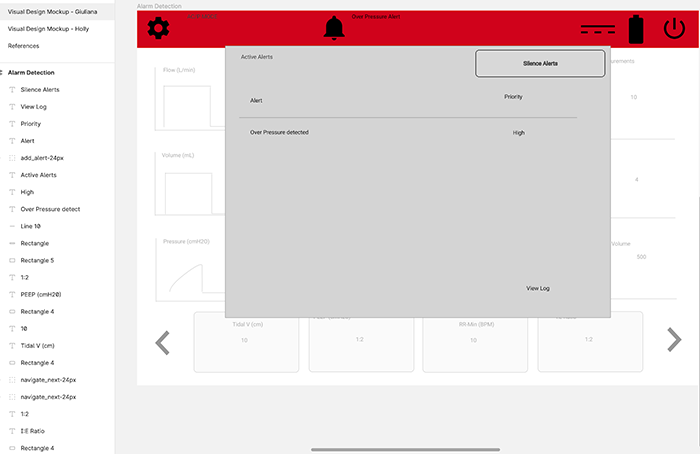
This is the alert screen, which is activated when an alert condition occurs.
Setting Popup
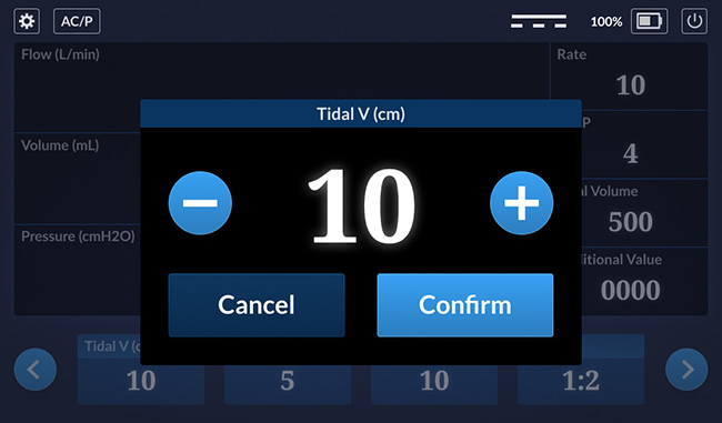
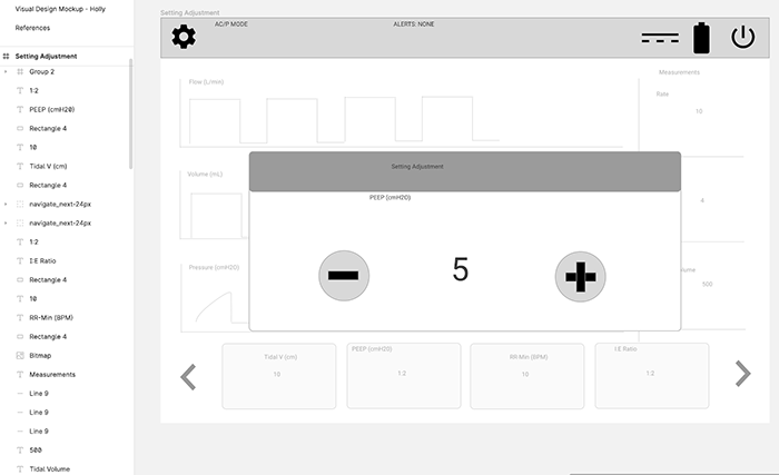
This is a detail of a setting popup that lets the user change a value on the bottom row.
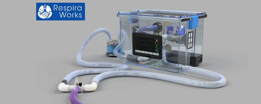
This is what we anticipate the final device will look like once complete.
May 4, 2020
Last Friday, I blogged about the wireframes. Today I’m showing off the visual design concepts. We asked two of our designers to come up with concepts: a light theme and a dark theme. (See below for the themes for the main screen.) Typically, medical devices feature a dark theme so they can be used most unobtrusively in a dimly lit patient room but we still wanted to explore a light theme for comparison.
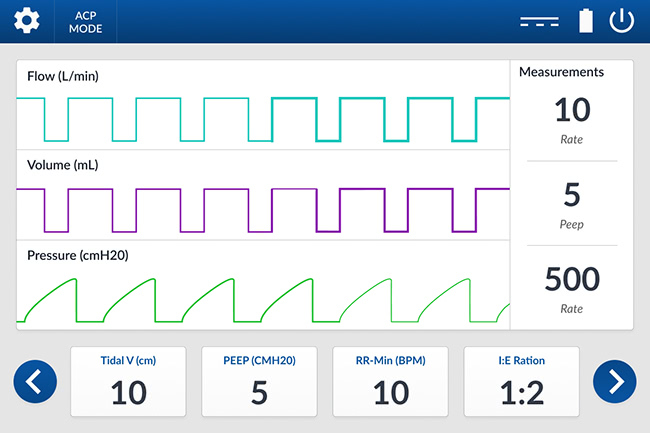
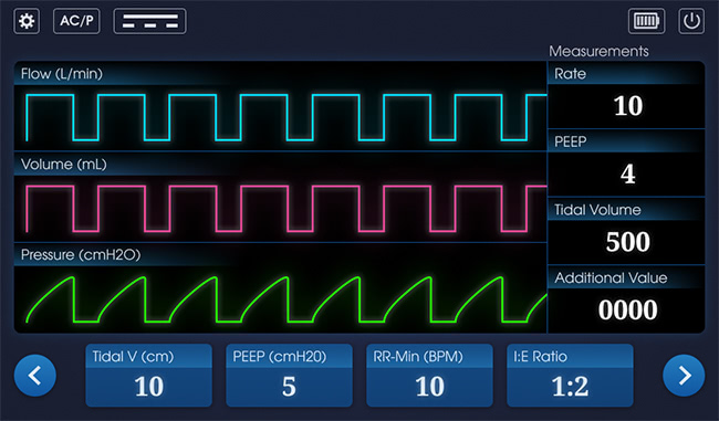
Note that it’s not just "dark vs light." For instance, the designers have offered two options for fonts. Which do you think is easier to read? What about the shape of the buttons on the bottom, and their labels? Which option is easiest to read? What about the labels on the measurements panel? How about the battery icon? Do you prefer horizontal or vertical? Which option offers the best usability? Choose the details you like and let me know in the comments on social media.
In addition to the basic screens, we also have to think about the graphs showing the waveforms. At this point, I’m not sure whether this should be done in QML or OpenGL. There’s also a question of whether the waveforms need some preprocessing before putting the pixels on the screen. ICS has a similar project that we can use as a proxy, and try on the RPi. This way we can evaluate the performance before writing new code.
Tomorrow we present our work. There are lots of questions about exactly how it needs to work. Also, I wish we could do some user testing. At this point in a typical project we would use the drawing to solicit feedback from users. In this case, I’m not sure how that’s going to be accomplished. Stay tuned.
May 1, 2020
I received the background information. Nothing surprising. Almost all medical devices have the HMI separated from the rest of the system so that if one part fails the other part can warn the user. In this case, it’s a RaspberryPi running the HMI and a microcontroller on the backend.
Our job at ICS is going to be getting the HMI on the RPi. At first view it looks like a job for C++/Qt and Linux, probably Yocto. But our team doesn't yet know if there are real-time requirements.
Speaking of requirements, writing the code seems like it should be pretty straightforward. The hard part is going to be adhering to the 62304 process, and creating documentation. Sometimes this can represent as much as 80% of the total effort. Developing code with a quality management system (QMS) is a bit like going to the gym. It’s uncomfortable until you get into the groove. But in the end, you feel better all around.
RespiraWorks shared a nice rendering of the device they aim to build. Here’s a look at initial sketches of the device’s UI. These screenshots are from April 22.
Main Screen
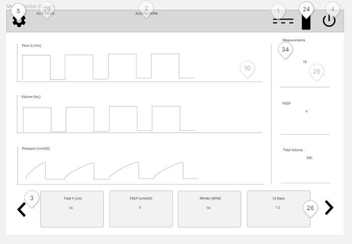
This is the main screen. We brought it into Figma and started asking lots of questions, like what items were off screen on the carousel? Could you swipe it or only use the arrows? What areas are clickable? And, what’s that funny icon next to the power and battery?
On just five screens, we had to go over 30 or 40 details. But, this exercise is very helpful. We like to dig into the UX and use it to uncover as many details as possible. On a typical project, we might go through five or six rounds of revisions with a client to refine the workflow and details. At this point we often move on to user testing. But, on this particular project I expect we’ll move onto visual design soon.
My main concern right now are the waveforms. They’re easy to draw by hand but I wonder whether there will be significant challenges keeping them in real time or during rendering. We’ll address those issues if they arise.
Here are the other screens:
Setting Adjustment Pop-up
Boot/Startup
Alerts Pop-Up
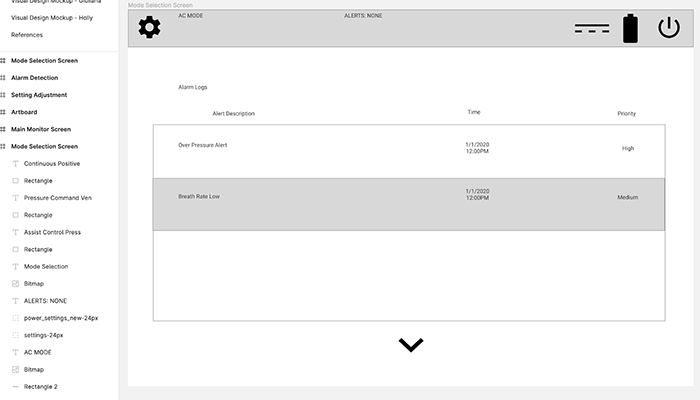
Alerts Log
April 29, 2020
ICS recently received a request to help develop an open source ventilator. The request came from RespiraWorks, an organization made up of dozens of engineers, healthcare workers and other professionals around the world. Their goal is to create a ventilator that can be built and deployed globally.
I was initially hesitant because though ventilators were big in the news a couple of weeks ago, by now I’ve heard of dozens of projects. When I learned more about the team and their goals, I was impressed. They aren’t trying to rush a product out the door for a crisis. Rather, they're aiming to solve the second wave, and in particular help people in economically disadvantaged countries.
If you read the news about other ventilator projects, most of them are not dealing with FDA approval. Or, they're just trying to get certified for an emergency. Respira is working toward a full medical-grade product that can be assembled with available parts for under $500.
It became clear to me that ICS needed to devote resources to this project because we're all in this together. I feel strongly that if you're in a position to help, you should help. So we are.
Unlike every other project ICS works on, the Respira project is not under NDA so I'm free to share details. I thought you might find this interesting so I'm planning to blog about it regularly. I’ll keep posting progress updates every few days as the project develops so check back often.