
A Look at Input Masks and Validators in the QML Environment
In a previous blog post I described how to use Qt's facility for input masks and validators in widget-based applications. In this installment I'll look at the corresponding support in QML.
Input Masks
The QML TextInput and TextField types have similar support for input masks as the QLineInput widget. TextInput is a QML type built in to Qt Quick (available when you import QtQuick) and TextField is a more sophisticated type that is included as part of the Qt Quick Controls 2.
There is also support for input mask in the TextField type from the Qt Quick Controls 1, but these are now deprecated and should not be used in new code, so I won't cover it in this post.
Both TextInput and TextField support an inputMask property of type string. The input mask string works exactly the same way as the QLineEdit widget's input mask property.
These types also support an acceptableInput property which, like for QLineEdit, indicates if the text value is acceptable to the input mask (if one has been set).
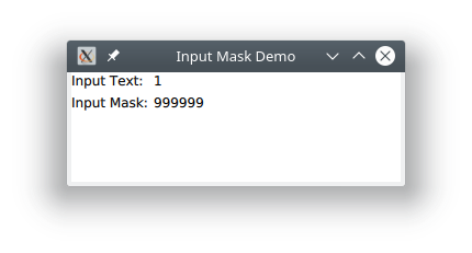
Here is a small standalone example that shows how to use an input mask with a TextInput. Like the widgets example in the last blog, it allows you to enter an input mask, and indicates in the output if the string value is acceptable. You can run the example using the qmlscene program.
import QtQuick 2.9
import QtQuick.Window 2.2
import QtQuick.Layouts 1.0

Window {
    visible: true
    width: 300
    height: 100
    title: qsTr("Input Mask Demo")

    GridLayout {
        columns: 2

        Text {
            id: label1
            text: qsTr("Input Text:")
        }

        TextInput {
            id: input
            text: qsTr("1")
            inputMask: mask.text
            onTextChanged: acceptableInput ? print("Input acceptable") : print("Input not acceptable")
        }

        Text {
            id: label2
            text: qsTr("Input Mask:")
        }

        TextInput {
            id: mask
            text: qsTr("999999")
        }
    }
}
Here is a screen shot of the example running:
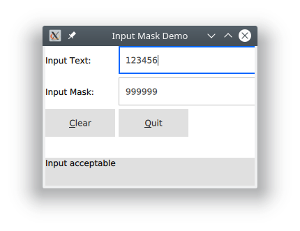
Here is a similar example that uses a TextField control instead, and shows the status in the footer bar of an application window:
import QtQuick 2.9
import QtQuick.Window 2.2
import QtQuick.Layouts 1.0
import QtQuick.Controls 2.4

ApplicationWindow {
    visible: true
    width: 300
    height: 200
    title: qsTr("Input Mask Demo")
    footer: ToolBar {
        Label {
            Text {
                id: statusLine
            }
        }
    }

    GridLayout {
        columns: 2

        Text {
            id: label1
            text: qsTr("Input Text:")
        }

        TextField {
            id: input
            text: qsTr("1")
            inputMask: mask.text
            onTextChanged: acceptableInput ? statusLine.text = qsTr("Input acceptable") : statusLine.text = qsTr("Input not acceptable")
        }

        Text {
            id: label2
            text: qsTr("Input Mask:")
        }

        TextField {
            id: mask
            text: qsTr("999999")
        }

        Button {
            text: qsTr("&Clear")
            onClicked: {
                input.clear()
                mask.clear()
            }
        }
        Button {
            text: qsTr("&Quit")
            onClicked: {
                Qt.quit()
            }
        }
    }
}
This is a screen shot of the example running:
If you know how to use input masks with widgets, it works exactly the same way in the QML environment. The source code for this and the following examples can be downloaded from the link [6] and the end of the blog. The examples can be run under the qmlscene program.
Validators
Validators are also supported by a number of QML types and work essentially the same way as they do for widgets.
The QML types that support validators are TextInput, TextField, ComboxBox, and SpinBox. The latter three are part of the Qt Quick Controls 2 module.
Three QML validators types are provided: DoubleValidator, IntValidator, and RegExpValidator. These work the same as the corresponding C++ widget-based validators, with just a few differences:
- There is no abstract type corresponding to the QValidator class.
- Only the three validators are available, You can't implement your own custom validators directly in QML.
- There is only one regular expression validator, and it accepts JavaScript regular expressions.
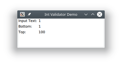
Here is an example of using an integer validator with a TextInput. Like the widgets-based example, you can set the range of allowed values.
import QtQuick 2.9
import QtQuick.Window 2.2
import QtQuick.Layouts 1.0

Window {
    visible: true
    width: 300
    height: 100
    title: qsTr("Int Validator Demo")

    GridLayout {
        columns: 2

        Text {
            id: label1
            text: qsTr("Input Text:")
        }

        TextInput {
            id: input
            text: qsTr("1")
            validator: IntValidator {
                bottom: parseInt(bottom.text)
                top: parseInt(top.text)
            }
            onTextChanged: acceptableInput ? print("Input acceptable") : print("Input not acceptable")
        }

        Text {
            id: label2
            text: qsTr("Bottom:")
        }

        TextInput {
            id: bottom
            inputMask: "00000000"
            text: qsTr("1")
        }

        Text {
            id: label3
            text: qsTr("Top:")
        }

        TextInput {
            id: top
            inputMask: "00000000"
            text: qsTr("100")
        }
    }
}
The application looks like the screen shot below. You can change the range of limits by entering different values and see whether the entered input is acceptable in the application's console output:
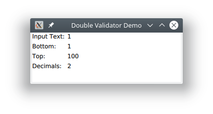
How here is a similar example, but using a double evaluator. It takes the same properties as the widget-based QDoubleValidator does. In the example I allow setting the lower and upper limits, as well as the number of digits. You can also set the locale and the notation format, but I didn't implement the ability to set those here:
import QtQuick 2.9
import QtQuick.Window 2.2
import QtQuick.Layouts 1.0

Window {
    visible: true
    width: 300
    height: 100
    title: qsTr("Double Validator Demo")

    GridLayout {
        columns: 2

        Text {
            id: label1
            text: qsTr("Input Text:")
        }

        TextInput {
            id: input
            text: qsTr("1")
            validator: DoubleValidator {
                bottom: parseInt(bottom.text)
                top: parseInt(top.text)
                decimals: parseInt(decimals.text)
            }
            onTextChanged: acceptableInput ? print("Input acceptable") : print("Input not acceptable")
        }

        Text {
            id: label2
            text: qsTr("Bottom:")
        }

        TextInput {
            id: bottom
            inputMask: "00000000"
            text: qsTr("1")
        }

        Text {
            id: label3
            text: qsTr("Top:")
        }

        TextInput {
            id: top
            inputMask: "00000000"
            text: qsTr("100")
        }

        Text {
            id: label4
            text: qsTr("Decimals:")
        }

        TextInput {
            id: decimals
            inputMask: "00"
            text: qsTr("2")
        }

    }
}
Typical output looks like this:
Finally, here is an example of using a RegExpValidator:
import QtQuick 2.9
import QtQuick.Window 2.2
import QtQuick.Layouts 1.0

Window {
    visible: true
    width: 300
    height: 100
    title: qsTr("Regular Expression Validator Demo")

    GridLayout {
        columns: 2

        Text {
            id: label1
            text: qsTr("Input Text:")
        }

        TextInput {
            id: input
            text: qsTr("1")
            validator: RegExpValidator {
                regExp: RegExp(regexp.text)
            }
            onTextChanged: acceptableInput ? print("Input acceptable") : print("Input not acceptable")
        }

        Text {
            id: label2
            text: qsTr("Regular Expression:")
        }

        TextInput {
            id: regexp
            text: "[a-zA-Z0-9]+"
        }
    }
}
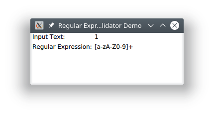
You can enter different regular expressions and experiment with the behavior. Here is a screen shot of the example running with the default values:
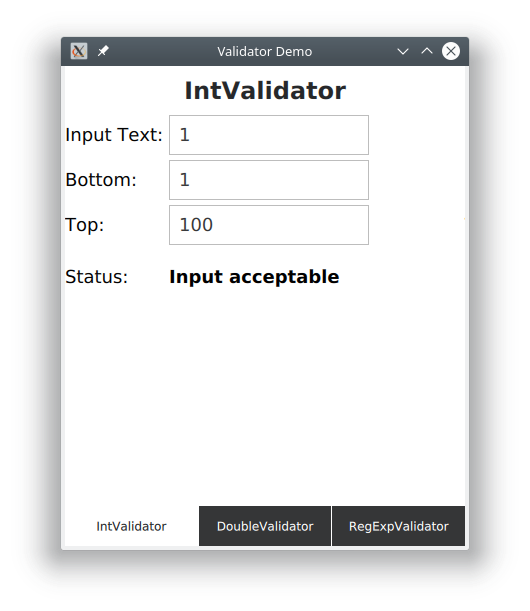
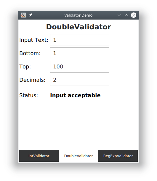
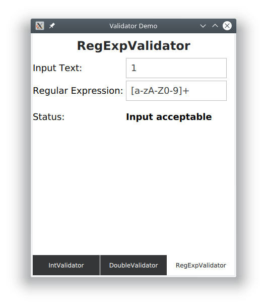
I also made a nicer example that uses the Qt Quick Controls and provides three swipeable pages that allow testing each of the three validator types. It uses the Qt Quick controls TextField type for input. Here are some screen shots of it running:
Conclusions
The idea of input masks and validators works well with widgets, and has been carried over into the QML environment where it works much the same way. By making use of these features, your QML-based applications can follow the same good UX design practices for input validation.
References
- http://doc.qt.io/qt-5/qml-qtquick-textinput.html
- https://doc.qt.io/qt-5/qml-qtquick-controls2-textfield.html
- http://doc.qt.io/qt-5/qml-qtquick-intvalidator.html
- http://doc.qt.io/qt-5/qml-qtquick-doublevalidator.html
- http://doc.qt.io/qt-5/qml-qtquick-regexpvalidator.html
- https://github.com/tranter/blogs/tree/master/MasksValidators