
Nearing the Finish Line with Project RED’s Low-Cost Ventilator
As 2020 wraps up we wanted to update you on the Project RED project, a non-profit initiative to develop an affordable emergency ventilator effective at treating the most common respiratory conditions associated with Covid-19 and other illnesses. Even though there are currently two FDA-approved vaccines, which hopefully will tamp down the pandemic, it will still take significant time for the majority of the world's population to receive injections, especially in developing nations. And the potential for future pandemics still exists. As such, these types of affordable ventilators are still badly needed.
After months of steady collaboration between ICS and the Project RED team, we’re in sight of the finish line. Here’s a look at the current UI working with the ventilator MCU to control ventilation:
To get to this point, the project team spent much time exploring the merits of various approaches for displaying the waveforms, which are read by a physician. Should we use a Y-axis scale or dynamic auto-scaling? The Y-axis option has the potential to compress some the waveforms, making them difficult to read, though auto-scaling is more complicated and brings its own technical challenges. The ultimate goal is to avoid user confusion and limit complexity for validation, verification and documentation.
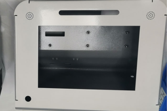
While this is being sorted, Project RED Co-founder Mohan Gurunathan and his team have been busy devising the mechanical design for the ventilator chassis. The team created four sets of “pre-production” ventilator parts fabricated by manufacturing partner HLH Prototypes. The fabricated parts include sheet metal pieces, machined polycarbonate blocks, machined aluminum, and 3D-printed ABS parts.
“Pre-production means that these are the part designs we plan to use in the final production ventilator, but we assume there will be some small issues found and tweaks made between now and then,” Gurunathan explained.
User Feedback Critical to Design Success
Regarding the user interface (UI), Project RED has made some changes to the initial design to accommodate user feedback and in the process solved some tricky problems. One of the issues involved the appearance of color on the target device hardware versus how it looked on the computer screen that the stakeholders used for approvals.
When viewing the UI on a standard desktop monitor, the colors appeared exactly as designed and approved. However, on the actual device screen that wasn’t the case. For instance, the clean blue that ICS' UX designers spec’d looked washed out, almost purple on the device. That meant a new round of color corrections and negotiations with the stakeholders was needed. You can read more about this here.
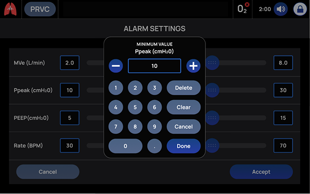
Another UX/UI design issue revolved around the sliders a physician would use to operate the device. ICS’ design team originally proposed horizontal sliders to enable the user to slide left or right and use a popup screen with a keypad to indicate the desired numeric value. The reasoning: horizontal sliders reduce selection error. On a landscape-oriented screen typical of ventilators, horizontal sliders provide more pixels to slide across and choose from. This means the user is more likely to land on or very near the value they’re attempting to select.
The incorporated keypad was intended to further improve accuracy. The numbers in the black boxes with blue outlines represent the exact value that has been selected. If the user cannot select the exact measurement they want with their finger, they have the option to type in a specific measurement for precision.
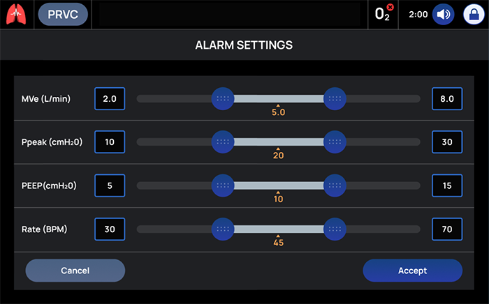
The downside is that horizontal sliders are a bit unconventional. User testing revealed that the target audience preferred a more traditional vertical format because that's what they're used to. Our target users also indicated that they disliked the keypad popup because when it is active, it prevents the user from interacting with anything else while configuring the measurement.
To address this critical feedback, our UX team designed a vertical slider design that did not incorporate popup keypad. This more conventional design means ventilator operators are familiar and comfortable with interaction, mitigating any learning curve. Also, the lack of popup speeds use because there are no extra screens to close before exiting.
In addition, the vertical format allows for quick incremental changes. The user can tap a knob in order to make a “+” and “-” appear on the left and right of the number, or press the “+” button to add an increment and press “-” to decrease the increment.
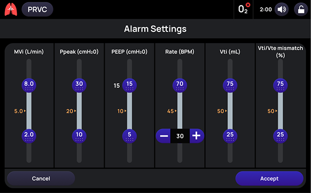
Of course, there are some drawbacks to the vertical style, which we’ve done our best to mitigate. For instance, this format provides less control of the slider itself. When using vertical space on a horizontally aligned screen, the slider has fewer pixels between increments. That means users have less control over what they’re trying to select. Also, there is less label space and some of the required labels could not fit on one line. To accommodate that, we’ve displayed the number value on the knob instead of next to the slider.
But… after this work was completed, further user testing indicated that touchscreen sliders weren’t optimal for physicians wearing surgical gloves while operating the ventilator. In response, the UX team is busy replacing these sliders with push-buttons interactions. Further, the push buttons will not activate immediately but rather after a three-second hold in order to mitigate use error.
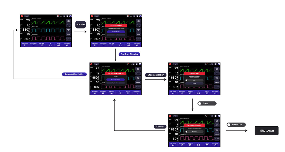
Here’s a look at some of the design updates we’re working on. They include many features aimed at ensuring patient safety. For example, we've revised the pre-use check so it doesn't shut down if it fails but instead gives the user the option to retry it. We've also provided a physical power-down button that can be used to shut down the machine as long as there is no ventilation in progress. In addition, we've added extra steps to prevent ventilation from being stopped inadvertently so the updated UI includes four steps: request standby, confirm standby, request stop, confirm stop. All of these changes will ultimately reduce risk and provide greater usability.
Going Forward
Beyond making these updates, the Project RED team is finalizing a list of remaining features needed to complete the UI/MCU interface. Once that’s finished and the scaling question has been addressed, we’re ready to prepare documentation for our FDA submission.
In the meanwhile, ICS’ UX team is working on some projects related to — but distinct from — the production ventilator. First, we’re designing a companion app that allows nurses to track the status of all ventilators throughout their unit without having to travel to each room. Using WiFi, the app will show the status of each ventilator. Is it turned on? Is there an alarm going off? You get the idea.
We’re also working on an alternate version of the ventilator itself as a way to showcase the project to our customers. Our demo version will incorporate additional capabilities not included in the production model, such as Bluetooth and WiFi.
Creating this low-cost ventilator in collaboration with Project RED has been an interesting and rewarding experience. We anticipate this new device will prove useful globally in the fight against Covid-19, as well to combat other respiratory diseases.
For more on our ventilator work, check out ICS Works on Ventilator Projects and Do My Eyes Deceive Me. For more on the hardware aspects of the project, visit Project RED.