Kiosks and Learnable Interfaces
When a person encounters a kiosk or computer device in a public space, such as a sales or museum kiosk, they can only benefit from it if they can figure out how to interact with it rather quickly. So one of the requirements of public interactive devices is that they be very easy to use, or easy to learn to use. But the learnability must be part of the user experience design. Depending on the content, a design may use very common interactive navigation patterns such as “next” and “previous” buttons that leave no questions about how to interact with them.

 +
+ 
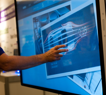 When installing a touchscreen kiosk, the angle of the screen is a major consideration. First, it affects how quickly people perceive the device as interactive and also touch-enabled. (See my previous post, Is That a Kiosk? How to Best Position Your Public Touchscreen Display for Use.) Second, it affects how comfortable it is for users to perform touch gestures.